There’s a moment every e-commerce designer knows — when the website is live, the products are beautiful, and yet the screenshots look completely lifeless. That’s where an iPad mockup changes everything.
In the competitive world of online retail, presentation isn’t just polish — it’s persuasion. How you show your store matters almost as much as what’s inside it. And with Apple’s iPad dominating tablet commerce traffic, placing your interface inside a sleek, photorealistic Apple device isn’t a design indulgence. It’s a conversion strategy.
Why e-commerce brands need device mockups
Shoppers don’t just buy products — they buy confidence. When a potential customer sees a beautifully framed store interface sitting inside a premium Apple device, something subtle but powerful happens: the product inherits the brand equity of the device itself. Cleanliness, precision, and reliability all transfer in a single glance.
The rise of the tablet as a shopping device makes this even more relevant. iPads occupy a uniquely desirable middle space — more immersive than a phone, more intimate than a laptop. For e-commerce, this means longer sessions, larger cart values, and more deliberate purchase decisions. Showing your store on an iPad isn’t just aspirational. It’s targeting your most valuable audience where they live.
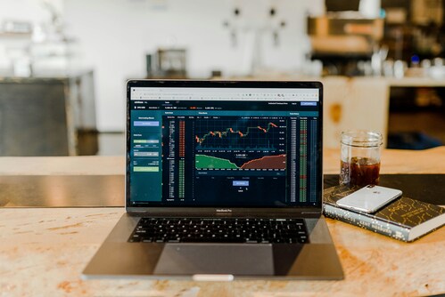
Beyond consumer psychology, mockups solve a real production problem. Raw screenshots are cold. They lack context, scale, and atmosphere. Wrapping your UI in a device frame does what no style guide ever could: it shows your work as it will actually be experienced.
Practical examples: iPad mockups in the wild
Portfolio presentations are where mockups first proved their worth. A UX designer pitching a new checkout flow doesn’t hand clients a Figma export — they present a framed, lit, perspective-rendered iPad scene that makes abstract wireframes feel tangible and real. Clients sign off faster when they can see the vision, not just imagine it.
Social media campaigns rely on device mockups constantly. When a Shopify store owner wants to promote their new collection on Instagram, a product photo staged beside an iPad showing the online shop creates a lifestyle moment. It’s visual storytelling: “This is the experience you’re invited into.”
App store listings and landing pages are another major use case. If your e-commerce platform has a companion iPad app, the listing screenshots need to communicate quality instantly. Photorealistic mockups with proper lighting and angle give that impression in under two seconds.
Investor decks and pitch materials benefit enormously from polished mockup scenes. When raising funding for a DTC brand, showing your platform inside a beautifully rendered iPad communicates a level of finish that raw screenshots simply cannot. It signals: we care about every detail.
Email marketing headers are a subtler but high-impact application. An abandoned-cart email that features the customer’s browsed product inside a clean iPad frame feels aspirational rather than pushy. The device adds context; the context adds desire.
Choosing the right angle and style
Not every iPad mockup works for every purpose. The angle, background, and color scheme of your chosen scene should match the emotion you’re trying to communicate.
- Front-facing, centered: Best for showcasing UI layouts, checkout flows, and full-page designs. Clean, editorial, direct. Ideal for documentation, blog headers, and ad creatives.
- Perspective / 3D angle: Adds depth and dynamism. Works beautifully for hero sections, landing pages, and portfolio pieces where you want the device to feel like a physical object in space.
- Flat lay (top-down): The lifestyle choice. Pairs the iPad with desk accessories, plants, coffee cups, or product samples. Perfect for social content, brand campaigns, and editorial spreads.
- Hands-on scenes: Someone holding or tapping the iPad makes the interface feel live and interactive. Effective for onboarding screens, app demos, and anything meant to communicate ease of use.
Pro tip: match your mockup’s background color style to your brand palette. A warm off-white scene with soft shadows works beautifully for a natural skincare brand. A dark studio scene with sharp highlights suits a luxury fashion or tech store. Coherence between device scene and brand aesthetic is what separates good mockups from great ones.
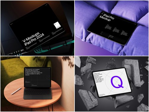
iPad mockups on ls.graphics
Among the resources available to designers today, ls.graphics stands out for the quality and depth of its iPad mockup library. This isn’t a collection of generic device outlines — it’s a curated set of scenes built with a level of craft that becomes visible the moment you put your interface inside them.
- Ultra-realistic rendering — Lighting, shadows, and reflections are physically accurate. Your UI looks like a real photograph, not a composite.
- Organized layers — Every element is logically named and grouped. Swapping your screen takes seconds, not minutes of layer archaeology.
- Many viewing angles — Front, perspective, flat lay, isometric, hands-on — the full range needed across different design contexts.
- Multiple color styles — Space Gray, Silver, and other Apple finishes let you match mockup tone to brand mood.
- Minimalist compositions — Stylish, modern backgrounds and props that frame the device without competing with your content.
But there’s one more thing that makes ls.graphics truly indispensable: a generous library of free scenes to explore before committing, and an Edit Online feature that cuts the whole process down to under a minute — no Photoshop, no downloads, just upload your screenshot and export a finished mockup straight from the browser.
Integrating mockups into your e-commerce workflow
The best time to think about mockups is not after launch — it’s during the design phase itself. When mockups are part of your workflow from the beginning, they serve as both presentation tools and quality filters. If your layout looks awkward inside a real device frame, it’s often a signal that something needs adjustment before development, not after.
- Design reviews: Share perspective-angle iPad mockups with stakeholders during review rounds. Feedback becomes more specific and constructive when people see the design in context, not floating in a white void.
- A/B testing creatives: Running paid ads? Test different mockup angles as ad visuals. Data often reveals that a flat-lay performs better for lifestyle products while a straight-on angle wins for SaaS tools and dashboards.
- Documentation and handoffs: Use front-facing mockups in design documentation to show how components should appear at tablet breakpoints. It bridges the gap between design and development more clearly than annotated wireframes alone.
Conclusion
A great e-commerce website deserves to be seen in its best light. iPad mockups aren’t decoration — they’re communication tools that build trust, elevate perception, and give your brand the visual authority it needs to compete.
For quality that matches that ambition, ls.graphics offers a premium, craft-led mockup library with free scenes to get started today. Put your store in the right frame. The details are what people remember.